19 December 2016

Suspiria: A Review

Fig 1. Suspiria Poster, 1977
Suspiria (Argento, 1977) is a film about an American Ballet dancer who travels to Germany to study at a prestigious dance academy. But soon, she discovers the school is really a front for a series of dark murders by a coven of evil witches.

Fig 2. Suspiria (1977)


One things this film does well is convey an underlying sense of dread throughout. There is always a very strong use of the colour red in this film, from the outside of the building, to the main hallway and rooms within the building (see Fig 2). The colour Red is quite often used in cinema to depict desire, and also danger/suspense, and this film in a way depicts both of those with its striking set pieces - in the first instance, the girls have a passion to be the best dancer/performer in the school, and the underlying danger of the possibility of any one of the students being killed at any time.

We can see in Fig 3 that the main character, Suzy, is in the office of the dance academy. The red hue that has been applied to the scene helps emphasise to us that she is either currently in danger, or that she is about to be.

"And then there's Argento's masterful use of deep primary colours — the sets are bathed in garish red and green light (he acquired 1950s Technicolor stock to get the effect) giving the whole film a hallucinatory intensity."
(Smith, 2000)

This quote not only provides background information on how the hues were achieved, but reinforces the notion that the goings-on in the film are very surreal and dream-like, almost to a fault.

Fig 3. Suspiria (1977)

Something the film does differently to normal is prey on our drowsiness and dream-like states when watching the piece. It makes us more susceptible to being shocked by the goings-on in the film, but particularly with Suspiria, in that we, like Suzy, have a difficult time discerning between what is really happening and what is a figment of imagination.

"But unlike so many lazy films that simply position its characters to advance a plot no matter what, Argento is aware that we are at our most curious when we are asleep"
(Hall, 2016)

This quote is playing upon the fact that, when we are in a dream state, we do things we normally wouldn't. We'll just ignore or dismiss anything that would normally be considered strange, like choose to walk along a road barefoot rather than take a bus, or stay at a ballet school where people are disappearing and being killed left, right and centre. Argento is a master craftsman when it comes to Horror films, making sure to lure everyone into a false sense of security, and strike at the most opportune moment.


Suspiria, like many other films, uses an amazing score to complement the footage on screen. The soundtrack for Suspiria was written by the Italian band "Goblin", and creates a constant sense of unease throughout.

"In a film where character are stalked, observed, and hunted, this score is a signifier that you are not alone"
(Hall, 2016)

Every horror film's soundtrack needs to be distinguishable, contrary to the old adage of "the best soundtrack is one that isn't noticeable". It needs to be able to heighten your state of wariness, keeping you on the edge of your seat at all times. Suspiria's soundtrack does just this, with it oftentimes being quite brash and loud, but never to the point of it being comical. Every piece of music ties in well with the lighting and set design, to make you feel continually apprehensive of what will happen next.


Bibliography:
  • Smith, A. (2015). Suspiria. Retrieved December 20, 2016, from http://www.empireonline.com/movies/suspiria/review/
  • Hall, J. (2016, February). Suspiria Review: A Bad Dream Made Real. Retrieved December 21, 2016, from http://www.slashfilm.com/suspiria-review/2/
  • Hall, J. (2016, February). Suspiria Review: A Bad Dream Made Real. Retrieved December 21, 2016, from http://www.slashfilm.com/suspiria-review/3/
Illustration List
  • Fig 1.: Suspiria (1977) [Poster] At: http://civilianglobal.com/images/sized/suspiriaposter_625_900.jpg?c2336f
  • Fig 2.: Suspiria (1977) From: Suspiria, Seda Spettacoli. Directed by: Dario Argento [Film Still] Italy: Seda Spettacoli 
  • Fig 3.: Suspiria (1977) From: Suspiria, Seda Spettacoli. Directed by: Dario Argento [Film Still] Italy: Seda Spettacoli 

What If? Metropolis - Reflective Statement

I'll start this off by saying my time management and organisation skills were not the best during this project. There were many times where I was rushing the work I was doing because I had not done it when I was meant to, or because I kept chopping and changing from one piece of work to another.

I struggled with the project towards the start. It was, in my opinion, a lot more intense than the previous one (Invisible Cities). But I feel that I improved significantly from that in this project, and that I improved over the time of the project as a whole, from the 1st OGR to Crit day. My understanding of Photoshop and Maya has grown considerably, and the feedback from the tutors and my peers was greatly valued and taken into consideration.

I appreciate all the help, feedback and advice that I received from everyone over this project, and look forward to working on the next one!

11 December 2016

@Phil - Final Concept Art


The Breakdown would be the same as on the previous versions of the painting, with the sky and buildings behind the rear monorail being the matte painting, and the rest being 3D Modelled.

6 December 2016

@Phil - Revised Final Painting - Take 2 inc.buildup

Final Painting

Buildup Gif

The matte painting would be the sky, and the taller buildings behind the rear monorail. Everything else would be 3D Modeled.

1 December 2016

The Shining: A Review

Fig 1: The Shining Poster, 1980

The Shining (Stanley Kubrick, Warner Bros., 1980) is a psychological horror film, based on Stephen King's 1977 novel of the same name. It follows the story of the Torrance family, played by Jack Nicholson (The Father, Jack Torrance), Shelley Duvall (The Mother, Wendy Torrance), and Danny Lloyd (The Son, Danny Torrance). They head to the isolated and remote Overlook Hotel for the winter, where a spiritual and evil presence turns Jack to violence, while Dylan sees disturbing images from the past and the future.


The film does a very good job of constantly making the viewer feel uneasy, keeping them in suspense for when Danny's next vision will happen, or when Jack will snap angrily and harshly. One scene of note in this theme is when Wendy discovers Jack's typing. The camera cuts from in front of her, to behind her, looking at her from a distance. We then see Jack creep into shot, so that his entrance is not a surprise, and so that it doesn't detract from the impact of his lines, or when he attacks Hallorann, his only unexpected appearance in the film, and the only on-screen murder.


Fig 2. The Shining (1980)

"The way he told stories was sometimes antithetical to the way we are accustomed to receiving stories" - Spielberg, Kubrick Remembered (2014)

This scene was praised by Steven Spielberg, calling it a "great example of counter-intuitive direction", noting that the obvious way of the scene playing out would be Jack suddenly appearing over Wendy's shoulder as she's reading the manuscript, saying that this unusual way of filming and editing the scene had 2 main benefits: It allowed the remainder of the sequence to maintain tension without a moment of relief that would follow from a 'shock', and, as previously stated, that it saved the biggest surprise/scare for when Jack suddenly appears and kills Hallorann.


As Steven Spielberg said in Kubrick Remembered (2014), Kubrick had a habit of telling stories and portraying things on screen differently to other people. This can be seen in the lighting, the dolly shots, the crane moves, the zoom-ins on people's faces, the framing, the hot windows as backlight, his choice of lenses and his steadicam work, all playing a part in making this film, and Kubrick's others, stand out, making them memorable.

Fig 3. The Shining (1980)

"[On Stanley Kubrick] He was a chameleon. He never made the same picture twice. Every single picture is a different genre, a different period, a different story, a different risk" - Spielberg, Kubrick Remembered (2014)

Again, looking at Spielberg talking about and praising Kubrick's work, we can see that Kubrick strived to make each individual film he produced stand out from not only the other films available at the time, but also his own work. The Shining was one of the first films to use Steadicam technology, along with Marathon Man, Bound for Glory, and Rocky. Again, by using techniques that were new to the industry, and by already breaking the norms of cinema, Stanley Kubrick was able to make The Shining stand out from everyone else.


The Shining doesn't really do many things similarly to other films. As stated in the previous two quotes, and their supporting paragraphs, Kubrick did things differently to other filmmakers, and to his previous works. It was one of the first films to use Steadicam, like Suspiria (Dario Argento, 1977), another Psychological Thriller. Apart from this, there are not really any things that the film did similarly to others - which can be seen as both a good, and a bad thing - good in the sense that it's breaking the conventions of horror films, and it stands out more against the others, but bad in the sense that you aren't really able to compare the details of the film to another.

Fig 4. The Shining (1980)
"In several of your previous films you seem to have had a prior interest in the facts and problems which surround the story -- the nuclear threat, space travel, the relationship between violence and the state -- which led you to Dr. Strangelove, 2001: A Space Odyssey, A Clockwork Orange. In the case of The Shining, were you attracted first by the subject of ESP, or just by Stephen King's novel?" - Ciment, Kubrick on The Shining (1981)

This question was posed to Kubrick not long after the release of the film, and adds to the next point being made - Kubrick's films were always influenced by prior interests he had. In the case of The Shining, as he said in reply to the question, "I've always been interest in ESP and the Paranormal". This prior influence allowed Kubrick to take a more detailed approach when creating an atmosphere within the film, making the events seem more realistic than they normally would. On the manuscript of the novel, Kubrick said that;

"It was one of the most ingenious and exciting stories of the genre I had read. It seemed to strike an extraordinary balance between the psychological and the supernatural in such a way as to lead you to think that the supernatural would eventually be explained by the psychological" - Kubrick, Kubrick on The Shining (1981)

Kubrick saying this shows how much believability was important. He liked the fact that there was a possibility of the psychological, fact-based elements could be tied to the supernatural elements. This adds to the already well-established brand/recognisability of Kubrick's prior films.

Bibliography:
Fig 1: The Shining (1980) [Poster] At: http://designbuddy.com/wp-content/uploads/2012/12/saul-bass-poster-design.jpg
Fig 2: The Shining (1980) From: The Shining, Warner Bros. Directed by: Stanley Kubrick [ Film Still] Great Britain: Warner Bros, Hawk Films, Peregrine.
Fig 3: The Shining (1980) From: The Shining, Warner Bros. Directed by: Stanley Kubrick [ Film Still] Great Britain: Warner Bros, Hawk Films, Peregrine.

Quotes:
1. Kubrick Remembered, From: Stanley Kubrick: The Masterpiece Collection. (2014) Directed by Gary Khammar. [DVD] USA:  Light Source & Imagery
2. Kubrick Remembered, From: Stanley Kubrick: The Masterpiece Collection. (2014) Directed by Gary Khammar. [DVD] USA:  Light Source & Imagery
3. Kubrick on The Shining, From: Kubrick. (1981) Written by Michel Ciment
4. Kubrick on The Shining, From: Kubrick. (1981) Written by Michel Ciment

29 November 2016

What If? Metropolis - Revised Thumbnails Part 3

Basic linework structure of the Final Painting

Slightly more detailed structure of the Final Painting

27 November 2016

What If? Metropolis - Revised Thumbnails Part 2

The second of my revised Thumbnails. After receiving advice from fellow students, I made sure the Horizon line wasn't as visible as before. I have a feeling this is the painting I will make my final 3D Render.

25 November 2016

Adobe After Effects/Photoshop: Parallax

I created a painting in Photoshop using multiple layers (5 total), brought the Photoshop file into After Effects and animated it to appear ass if it were panning through an actual 3D space. I based my painting off of various pieces from my "What If? Metropolis" Project.

What If? Metropolis - Revised Thumbnails Part 1

This is a Maya Paint-over thumbnail I created. More to follow soon.

23 November 2016

What If? Metropolis - O.G.R. Part 2

What If? Metropolis - Final Painting

This will be my final painting for the What If? Metropolis project. I will break down what will be a matte painting and what will be a 3D Model in my O.G.R. Part 2.

Life Drawing Part 1

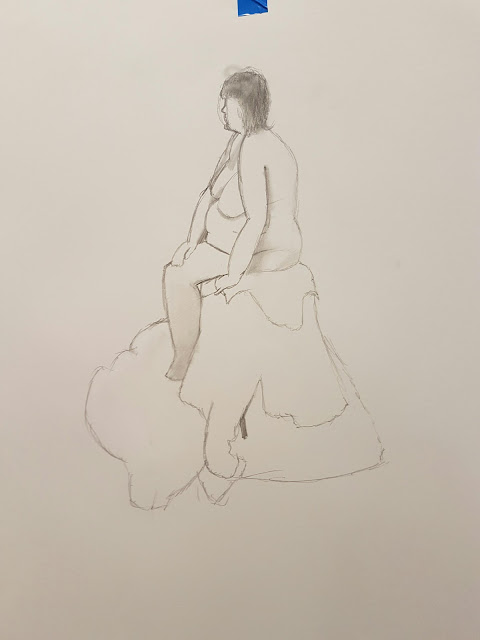
These are the photos from today's Life Drawing lesson. I shall upload the rest of my work from my previous life drawing classes at a later date.

22 November 2016

What If? Metropolis - Thumbnails 28-38

Thumbnails I created a while ago and had yet to upload, went in and re-numbered them to fit with the current timeline

What If? Metropolis - Thumbnails 26 & 27

Another building design, plus a sketch for the monorail system I'll use as the mode of transport within the city.

What If? Metropolis - Thumbnails 23-25

These are some thumbnails that I drew by hand on Sketch Paper, then scanned in to my computer and painted over in Photoshop.

18 November 2016

Adobe Animate 101: Run & Walk Cycles

In Today's lesson, we were tasked with creating Run Cycles in Adobe Animate. I decided to include the work I did last week on a walk cycle as a comparison, not only between the movement of the characters, but on how I had improved using the software, moving from premade shapes and lines to drawing freehand.

Basic Walk Cycle
Run Cycle (12fps)
Run Cycle (24fps)

15 November 2016

What If? Metropolis - Thumbnails 9-21

Top Row: From Left to Right; Establishing Shot, Building Colour test, Building Height test, Map #1, Housing Design #1, Curved Building
Bottom Row: Lamppost Colour test, Housing Design #2, Tree, Low Angle Shot, Cityscape Design, Map #2

What If? Metropolis - Thumbnails 1-8

8 basic thumbnail sketches for the city of Innavo.

From Left to Right: Tree (Var 1), Bush, Tree (Var 2), Bench, Bin, Lamp, Statues, Map


8 November 2016

Edward Scissorhands: A Review

Fig 1

In this review, I shall be looking at Edward Scissorhands (Tim Burton, 20th Century Fox, 1991).

Throughout the film, there is constant contradiction between creativity and conformity. One of the most obvious/apparent cases of this happens within the first few minutes of the film, where we have a shot of the suburb, all the colourful houses and perfect, green lawns, then in the background is a dark, depressing, monotone hill with a bland, grey mansion atop it.

Fig 2

The mansion on the hill is a good juxtaposition of the suburb below it, the latter representing "conformity", all the houses looking extremely similar, all the men leaving at the exact same time every morning to go off to work, etc, and the former being the contrast, the "creativity" (it is the mansion of an inventor, after all), despite being more drab and dreary. 

Fig 3

The contrast between the two location goes even further than the colourisation and hues, though. The actual way they've been designed and structured plays into this. The buildings in the suburb have all been built the exact same way, as you can see in Fig 3 and Fig 4, similar in the way that Levittown, a suburb in New York was designed, with each house being a carbon-copy of the previous, with one house being built every 16 minutes at the peak of construction. William Levitt himself called his company "The General Motors of the Housing Industry", and we can see that the suburb within the film definitely has that mass-produced feel.

Fig 4

The Mansion in which Edward resides is much blander, greyer and stretched out, almost Gothic in its architecture. The mansion and Edward himself were most likely designed to deliberately be a stark contrast to the typical "complacent" and "unimaginative" society of then modern America.

A quote I feel supports this, and ties things together, is "The final image of Edward in the colourful gardens, surrounded by nature and creativity reinforces the idea that American society is too sterile and narrow to cope with one who does not conform." The film, then, can be viewed as a satire, on how America was stuck in its ways, and was afraid of change, of non-conformity.

Bibliography & Illustrations
  • Fig 1 Edward Scissorhands Poster (1991) From: Edward Scissorhands - Directed by: Tim Burton
  • Fig 2 Edward Scissorhands Town Still (1991) From: Edward Scissorhands - Directed by: Tim Burton
  • Fig 3 Edward Scissorhands Town Still (1991) From: Edward Scissorhands - Directed by: Tim Burton
  • Fig 4 Edward Scissorhands Town Still (1991) From: Edward Scissorhands - Directed by: Tim Burton
  • Quote: Edward Scissorhands (2011) From http://www.mediamatters.co.uk/media/EdwSci.html - Written By: Ann Devine

20 October 2016

Invisible Cities: Crit Presentation

This is my Crit presentation for the "Invisible Cities" Project.

Invisible Cities: Final 3 Paintings

After a long, literal uphill struggle, a Man overlooks the city of Argia

Progress .GIF of the First Painting


The Man arrives at a building within the City. Curious, he opens the doors and ventures inside
 
Progress .GIF of the Second Painting


Upon entering the building, the Man realises it is a Church, decrepit and in disrepair. He sits down and prays

Progress .GIF of the Third and Final Painting

Adobe Animate 101: Ease-In/Ease Out & Constant Motion

These GIFs showcase the difference between two different movement styles in Adobe Animate - Ease In/Ease Out, and Constant motion. Constant Motion is where the subject is always moving at a constant speed (hence the name), whereas "Ease In/Ease Out" is seen as a more realistic way to prtray movement, where the object starts off moving gradually/slowly, speeding up during the main central chunk of its movement, before slowing down again at the end. Think, when you swing your arm in any given direction, it does not instantly reach its top speed from standing still, it builds speed up, reaches its apex, then loses that speed at the end. This is the principle behind Ease In/Ease Out.
Constant Motion
Ease In/Ease Out
Comparison between Ease In/Ease Out and Constant Motion